Reference gallery

The 10 websites Alexa chose in the brand strategy, with her notes, plus 5 we added. For each one we say what we’d borrow for Leap’s site and how much movement it brings. These are for inspiration only; we adapt ideas, never copy them.

  • Alexa’s pick from the brand strategy
  • Studio pick added by us
  • Core used throughout
  • Accent once per section
  • Rare once on the site
  • Section idea a layout to borrow

Alexa’s references

From the brand strategy, pages 13 to 22, in the order they appear. Her notes are quoted exactly.

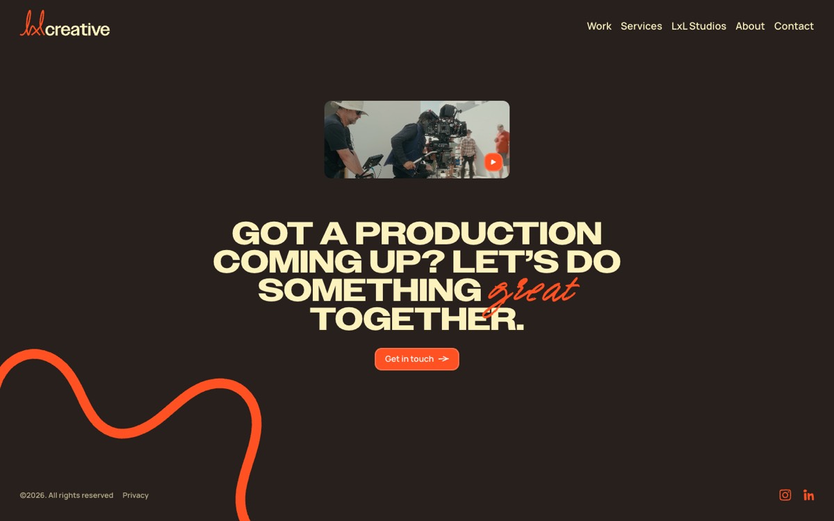
LxL Creative footer with a thick vermilion squiggle rising from the bottom-left behind the closing headline

LxL Creative

Alexa’s pick
lxlcreative.co.uk (opens in a new tab)
  • production company
  • squiggles
  • scroll-drawn lines
  • oversized type
  • dark
  • playful

Alexa’s note guide p.13

Moving squiggles near the bottom of the page. A reference for shapes that feel alive without dominating the layout.

What we’d borrow

Thick hand-drawn lines that draw themselves once when their section scrolls into view, then stay put behind the text. For Leap: one gradient squiggle per page, drawn once with SVG, partly cropped by the edge and kept behind the copy. No smooth-scroll library.

Core

Don’t copy: Their vermilion-on-charcoal palette, the loop shapes and the page-transition choreography.
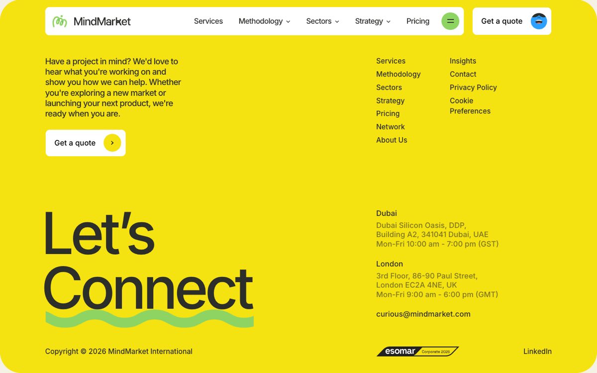
MindMarket yellow footer with a green wavy underline beneath the giant "Connect" headline

MindMarket

Alexa’s pick
mindmarket.com (opens in a new tab)
  • marketing agency
  • squiggles
  • playful
  • oversized type
  • warm palette
  • illustration

Alexa’s note guide p.13

Animated squiggles on page load and moving underlines. Useful for showing how a line can become part of the typography.

What we’d borrow

A wavy underline that drifts slowly under key words, made with a CSS mask. For Leap: a gradient squiggle underline that draws once under one key word per page, with an optional slow drift. We skip their loading-screen animation so content shows straight away.

Accent

Don’t copy: The green and yellow palette, the squiggle M mark and the character illustrations.

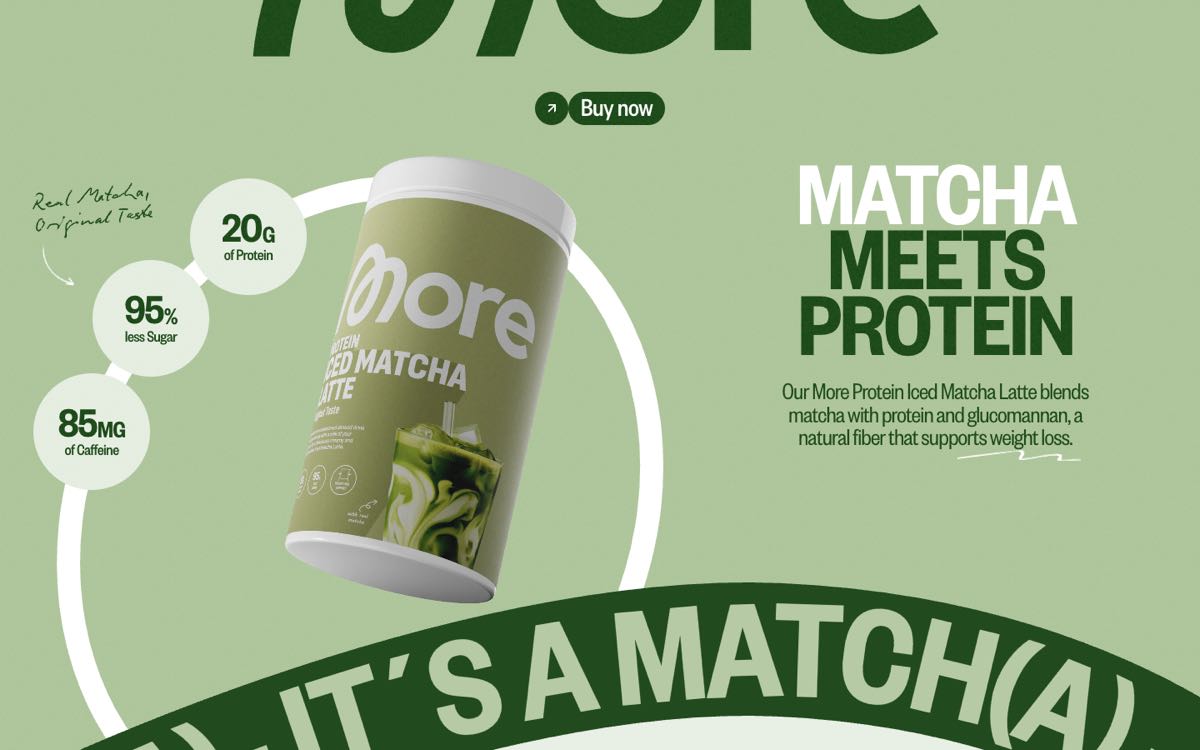
More Nutrition hero with a handwritten "Real Matcha, Original Taste" note and arrow beside a white ribbon ring behind the product tub

More Nutrition

Alexa’s pick
more-nutrition.webflow.io (opens in a new tab)
  • e-commerce
  • handwritten notes
  • scroll-drawn lines
  • sticker/collage
  • oversized type
  • playful

Alexa’s note guide p.13, p.18

Moving background squiggles and handwritten annotations. Also a reference for exploring a line that transforms into Leap's speech bubble.

Handwritten notes and expressive elements alongside typography.

What we’d borrow

A ribbon line that draws as you scroll, and little handwritten notes with arrows that gently jitter as if redrawn. For Leap: two or three margin notes in the handwriting font across the site, plus a once-only moment near the contact call to action where a line closes into the speech bubble. That morph is new design work; no reference shows it.

Core notesRare line to bubble

Don’t copy: The matcha palette, the looping M logo and the product-on-ring layout.

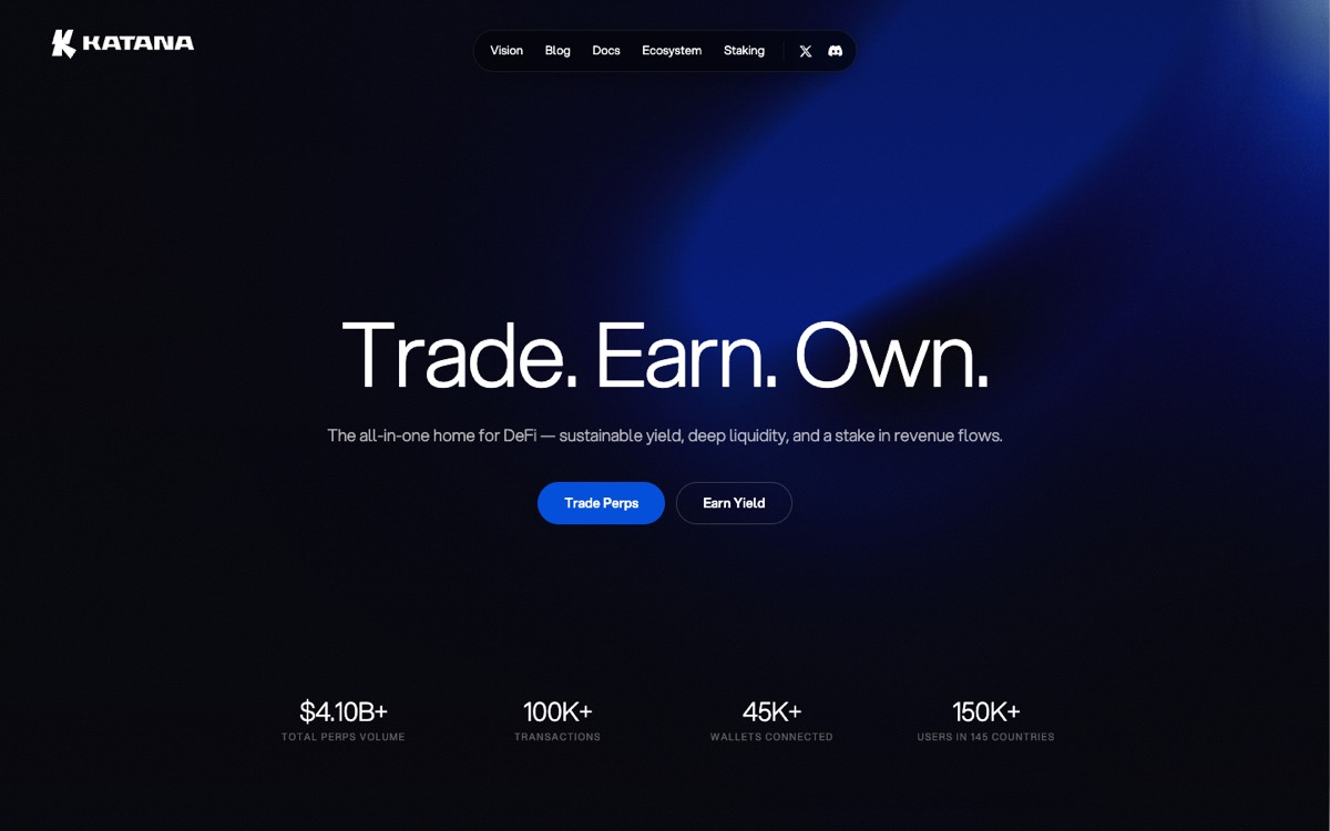
Katana Network dark hero with a large blurred blue gradient blob drifting behind the centred headline

Katana

Alexa’s pick
katana.network (opens in a new tab)
  • fintech/web3
  • WebGL
  • dark
  • minimal
  • calm motion

Alexa’s note guide p.15

A moving gradient bubble, maybe a softer version using Leap's existing colour palette.

What we’d borrow

A large glowing blob that drifts across a dark hero, rendered in WebGL. For Leap: the same feeling rebuilt in plain CSS, a soft yellow-peach-pink-lilac blob on the off-white that drifts over 20 seconds, pauses off-screen and stays still for visitors who prefer less motion. Much lighter than WebGL.

Core

Don’t copy: The dark crypto look, the electric blue and the WebGL rendering.

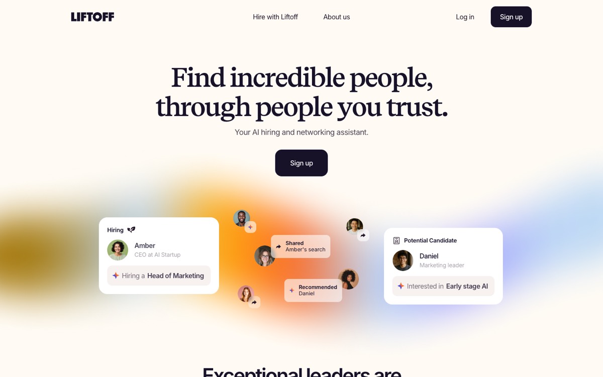
Liftoff hero: a soft orange, pink and blue gradient glow with small avatar and icon bubbles floating inside it, between two profile cards

Liftoff

Alexa’s pick
onliftoff.com (opens in a new tab)
  • SaaS/product
  • pastel gradient
  • warm palette
  • minimal
  • editorial
  • calm motion

Alexa’s note guide p.15

The gradient bubble containing icons, as well as the gradient footer treatment.

Gradient shapes to highlight smaller sections

What we’d borrow

Soft gradient glows behind small icons, and a warm gradient horizon at the foot of the page. For Leap: gradient icon chips on the six service cards, and a single gradient horizon behind the closing call to action, once on the site. A soft gradient card can also highlight one small section per page.

Core soft glowAccent icon chipsRare footer horizon

Don’t copy: Their copy, the three-column icon row as a block and the logo marquee.

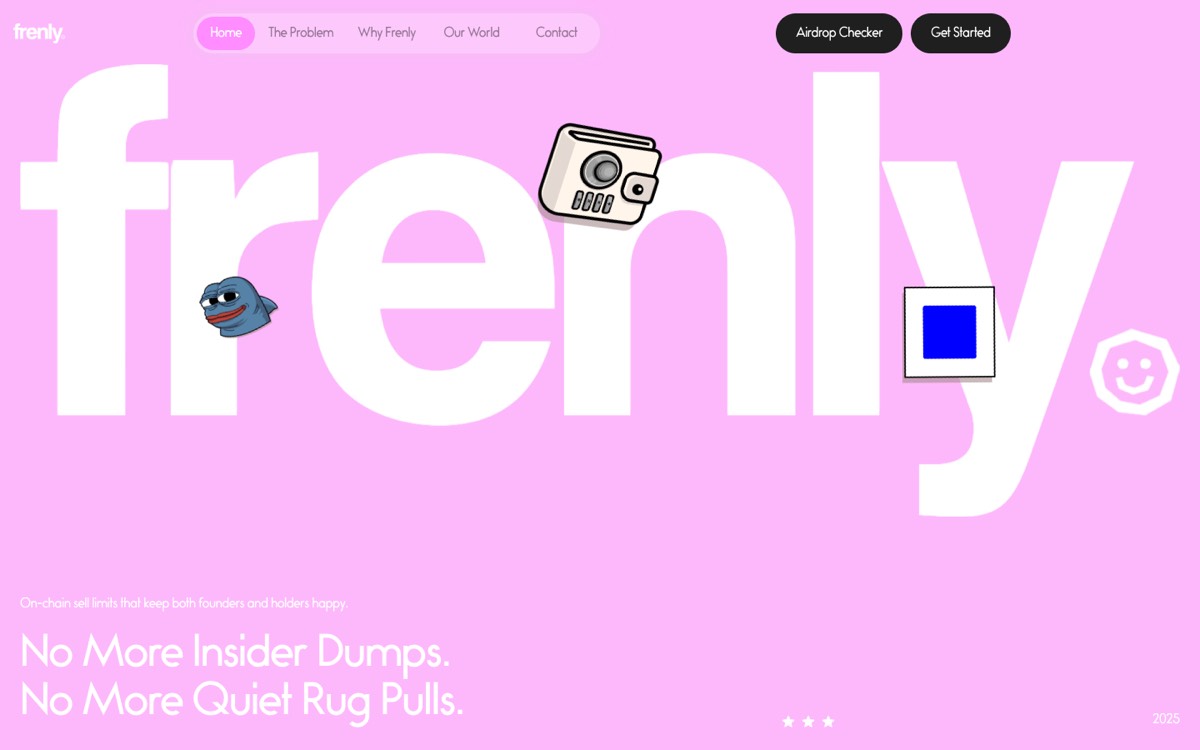
Frenly pink hero with a giant white "frenly" wordmark and sticker-style wallet, frog, card and smiley icons floating among the letters

Frenly

Alexa’s pick
getfrenly.com (opens in a new tab)
  • fintech/web3
  • oversized type
  • sticker/collage
  • playful
  • illustration

Alexa’s note guide p.18

Giant hero section with floating icons

What we’d borrow

A wordmark filling the screen with sticker-style objects tucked between the letters. For Leap: a large but calmer hero headline with three small floating shapes from the brand (the bubble outline, a squiggle, a soft blob) drifting a few pixels. Used once, on the home page.

Rare

Don’t copy: The meme stickers, the crypto imagery and the pink-and-white pairing.

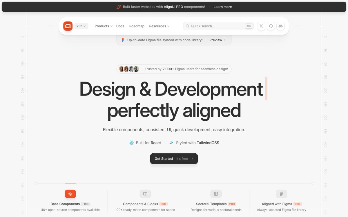
AlignUI hero with the two-line headline, a blinking caret after the typed first line

AlignUI

Alexa’s pick
alignui.com (opens in a new tab)
  • SaaS/product
  • typing effect
  • minimal
  • calm motion

Alexa’s note guide p.18

Typing & Deleting Animation: Text types out letter by letter, pauses, then deletes and is replaced by a new phrase, with a blinking cursor.

What we’d borrow

A headline that types, holds, deletes and types the next phrase, with a blinking cursor. For Leap: the main heading stays still and readable, and only the last phrase of the line below it types and changes (for example "We help brands find the right direction"). It stops after two rounds and is off for visitors who prefer less motion.

Rare

Don’t copy: Their headline copy, the developer-tool look and the code mockups.

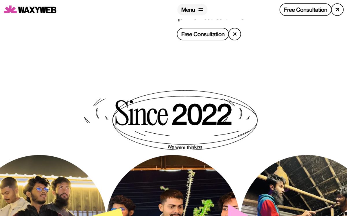
WaxyWeb "Since 2022" badge inside a hand-drawn wobbling ellipse, with the "Free Consultation" pill in the top bar and again above it

WaxyWeb

Alexa’s pick
waxyweb.com (opens in a new tab)
  • creative studio
  • editing marks
  • playful
  • sticker/collage
  • editorial
  • oversized type

Alexa’s note guide p.20

Reference to Since 2021 animation, which could be adapted into a small brand-history detail. + free consultation button on top bar for CTA

What we’d borrow

A hand-drawn ring around a "Since" date, and a consultation button that stays in the top bar. For Leap: a small "Since 2021" stamp in the handwriting font with a gradient ring that draws once (About page or footer), and the "Free consultation" pill always in the header. Their badge says 2022, so we'd like to confirm Leap's year.

Rare stampCore header button

Don’t copy: The "Since 2022" wording, their type pairing and the arched team photo.

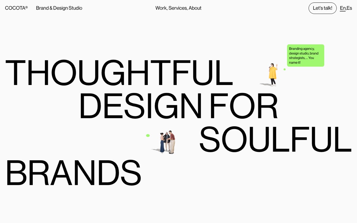
Cocota hero with huge uppercase headline, small cut-out people and a green speech bubble opened beside the woman on hover

Cocota Studio

Alexa’s pick
cocotastudio.com (opens in a new tab)
  • creative studio
  • oversized type
  • speech bubbles
  • illustration
  • minimal
  • playful

Alexa’s note guide p.22

Appearing speech bubbles as someone explores the page by hovering over the little animated people.

What we’d borrow

Little animated characters around the page that open a speech bubble when you hover them. For Leap: no characters, but small gradient dots that grow into a speech bubble with a short reply on hover, keyboard focus or tap. Calm until you go looking, which suits "Less noise".

Accent

Don’t copy: The cut-out characters, the green and purple pairing and the bubble copy.

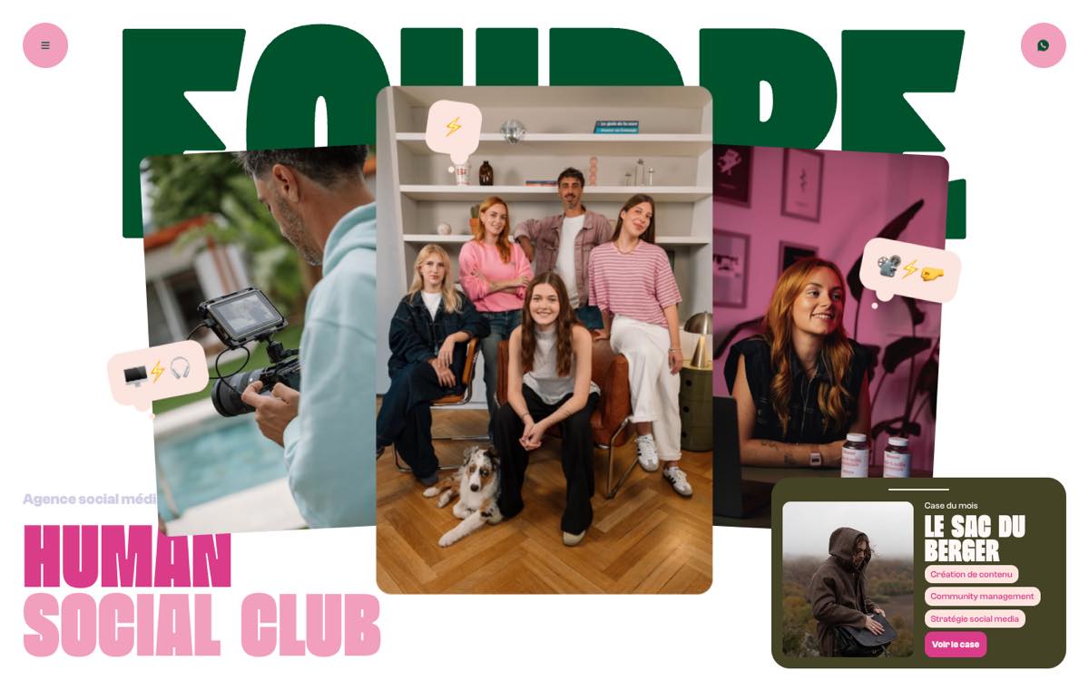
Agence Foudre hero with three tilted photo cards and pale pink chat bubbles holding emoji at their corners

Agence Foudre

Alexa’s pick
agencefoudre.com (opens in a new tab)
  • marketing agency
  • speech bubbles
  • playful
  • oversized type
  • sticker/collage
  • illustration

Alexa’s note guide p.22

Floating message bubble.

What we’d borrow

Small chat bubbles that bob gently in the hero. For Leap: three to five pastel bubbles with the logo's tail, carrying a handwritten word or a tiny glyph instead of emoji, floating slowly out of sync. The page also has a fixed WhatsApp button; we've asked Alexa which one she meant.

Core

Don’t copy: The pink and dark green palette, the heavy condensed lettering and their emoji set.

Also in the guide

A note in the guide that points to an image rather than a website.

  • Alexa’s note guide p.20

    An interactive strategy board where each element is highlighted when hovered over

    An image, not a website. We use it on the Approach page: five step cards on a soft board, each highlighted on hover or keyboard focus.

Studio picks

Sites we chose to add to Alexa’s list. Each one covers something her references don’t, and we say which part could inspire Leap.

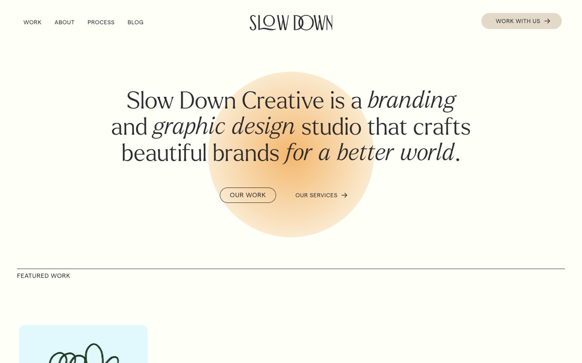
Slow Down Creative hero: a soft peach circle glowing behind the headline and the 'Our work' pill

Slow Down Creative

Studio pick
slowdowncreative.com (opens in a new tab)
  • creative studio
  • pastel gradient
  • warm palette
  • editorial
  • minimal
  • calm motion

What we’d borrow

Look at: The soft circle behind the hero heading, the warm glow behind the closing call to action, and the three-phase process page.

The calmest way to bring a gradient in: one soft circle behind the hero heading and a glow rising from the bottom of the page, once. Their process page explains three phases with lots of air and no motion. For Leap: the same restraint in the four brand colours, and an Approach page where each step reads like a message being refined.

Section idea process pageRare footer glow

Don’t copy: Their orange saturation and the smooth-scroll library.

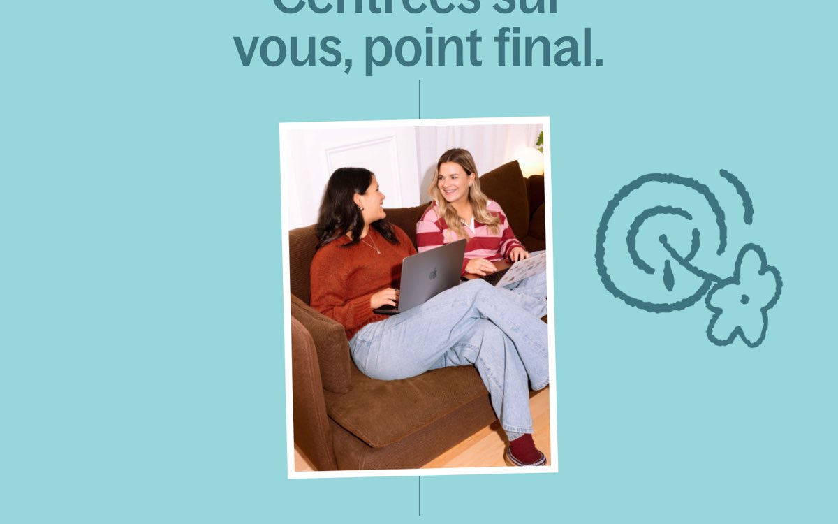
Agence Théo statement block: a tilted polaroid photo with a thick hand-drawn target-and-flower doodle beside it

Agence Théo

Studio pick
agencetheo.com (opens in a new tab)
  • communications studio
  • warm palette
  • oversized type
  • squiggles
  • sticker/collage
  • playful

What we’d borrow

Look at: The thick, round-ended doodle beside a polaroid-style photo, and the two-column services block.

A communications studio, like Leap, that uses a thick hand-drawn doodle beside a photo, as if someone had marked up a contact sheet. It is the closest live match to Leap's squiggle style and it is a simple static drawing. For Leap: one doodle per section next to a photo of Alexa or the work, and a plain, quiet services list.

Accent

Don’t copy: The flat aqua background and the dark teal call-to-action band; Leap stays on warm off-white.

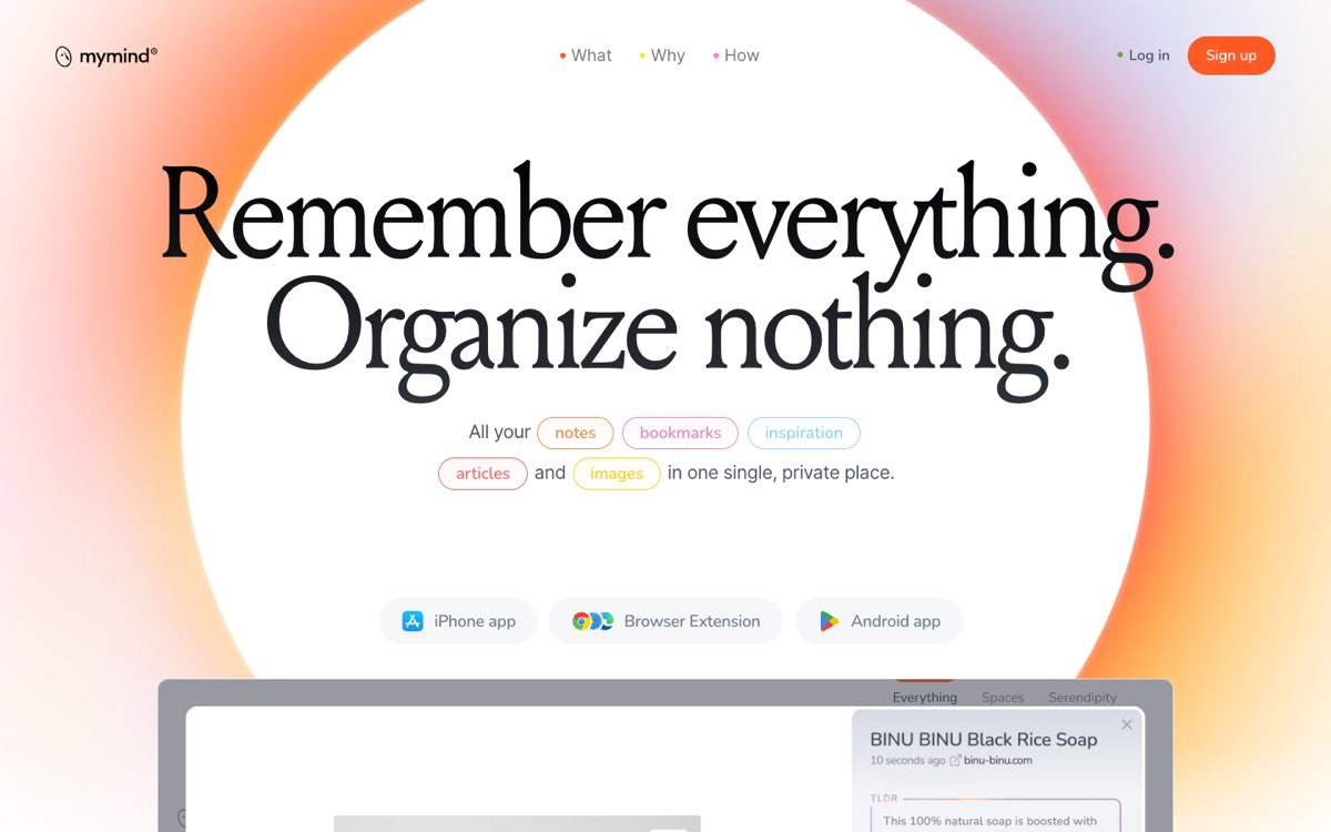
mymind hero: an orange, pink and lilac halo around a large white circle, the headline and pastel outlined word-pills

mymind

Studio pick
mymind.com (opens in a new tab)
  • SaaS/product
  • pastel gradient
  • oversized type
  • editorial
  • calm motion
  • minimal

What we’d borrow

Look at: The pastel halo around a white circle in the hero, and the sentence where key words sit in small pastel outlines.

A soft pastel halo frames the hero heading once, at the very top, and five key words each get a pastel outline. For Leap: a home-page hero inside a halo made from the four brand colours (built in CSS, not video), and one key word per section marked with a hand-drawn circle or selection box.

Rare halo heroAccent marked words

Don’t copy: The video used for the halo, the serif headline and the long scroll.

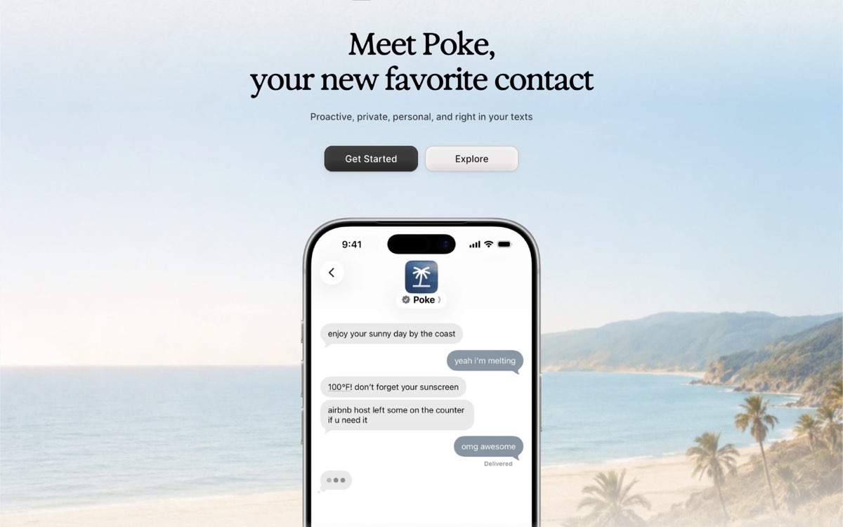
Poke hero: the 'Meet Poke' headline above a phone showing a text conversation

Poke

Studio pick
poke.com (opens in a new tab)
  • SaaS/product
  • conversational UI
  • speech bubbles
  • warm palette
  • editorial
  • calm motion

What we’d borrow

Look at: The hero conversation and the sections that tell the story through chat exchanges.

The best example we found of a conversation used to tell a story, in a calm tone. For Leap, it is the core idea in action: a short exchange where a visitor's worry gets a Leap reply, and a closing call to action framed as one friendly message. Leap's bubbles would be real text, so they stay readable and searchable.

Section idea conversation story, message-style call to action

Don’t copy: The phone mockup, the app-store framing and the photo background.

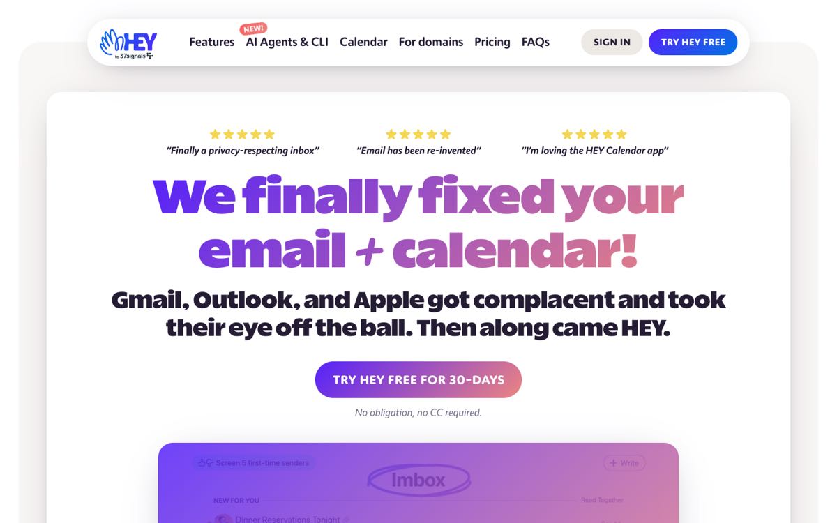
HEY hero: a purple-to-pink gradient headline with a gradient pill call to action

HEY

Studio pick
hey.com (opens in a new tab)
  • SaaS/product
  • pastel gradient
  • playful
  • editing marks
  • oversized type

What we’d borrow

Look at: The gradient running across the headline, the hand-drawn oval around a word, and the floating call-to-action pill.

A gradient runs through the headline text, and a hand-drawn oval circles one word. For Leap: gradient lettering only on the dark ink background, where it stays readable (on light backgrounds the gradient sits under the words as an underline or highlight instead), and a small persistent "Free consultation" pill carrying the speech-bubble mark.

Accent

Don’t copy: The saturated blue-purple start of their gradient and gradient on every heading.

How we’d combine them

Together these point to one calm system. A soft gradient blob sets the mood, a gradient line draws itself once under a key word, speech bubbles appear only where a real exchange happens, and short handwritten notes add a personal touch.

We leave out the heavy parts: WebGL backgrounds, smooth-scroll libraries, loading screens, characters and stickers, and anything that moves all the time. The full motion rules are in the design kit.